
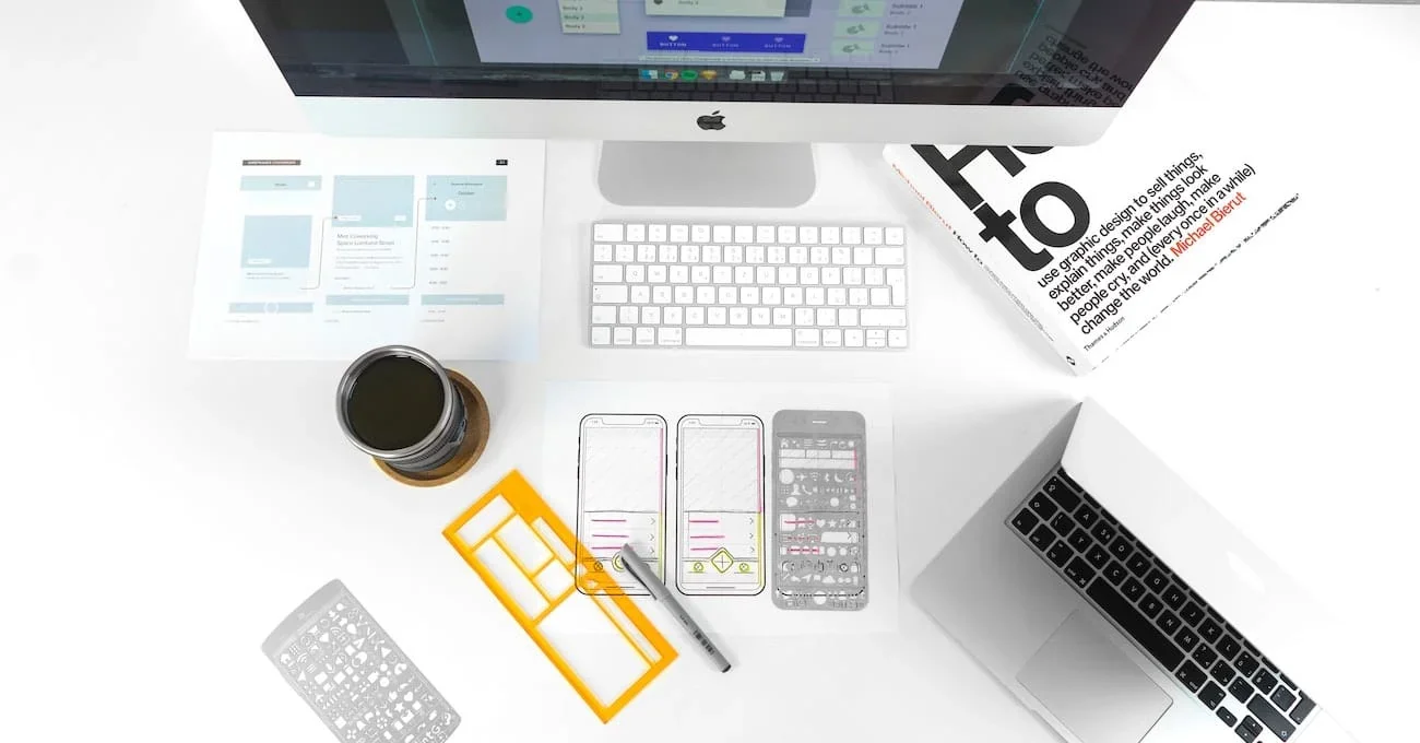
In every website or app you’re looking to build, the user interface design plays a huge role in ensuring a remarkable experience for its users. It’s more than just how a product looks, it’s how the interactive elements are strategically incorporated to facilitate interactions smoothly.
How the website or app is designed determines the success of the product. A functional and efficient user interface (UI) builds brand recognition and loyalty. It draws in users, facilitates interactions with them, and sustains their use of the product.
Without a strategic use of user interface elements, a steady influx of new and recurring users cannot be guaranteed. It has to be accessible and responsive to provide users with a seamless experience they’ll want to taste again.
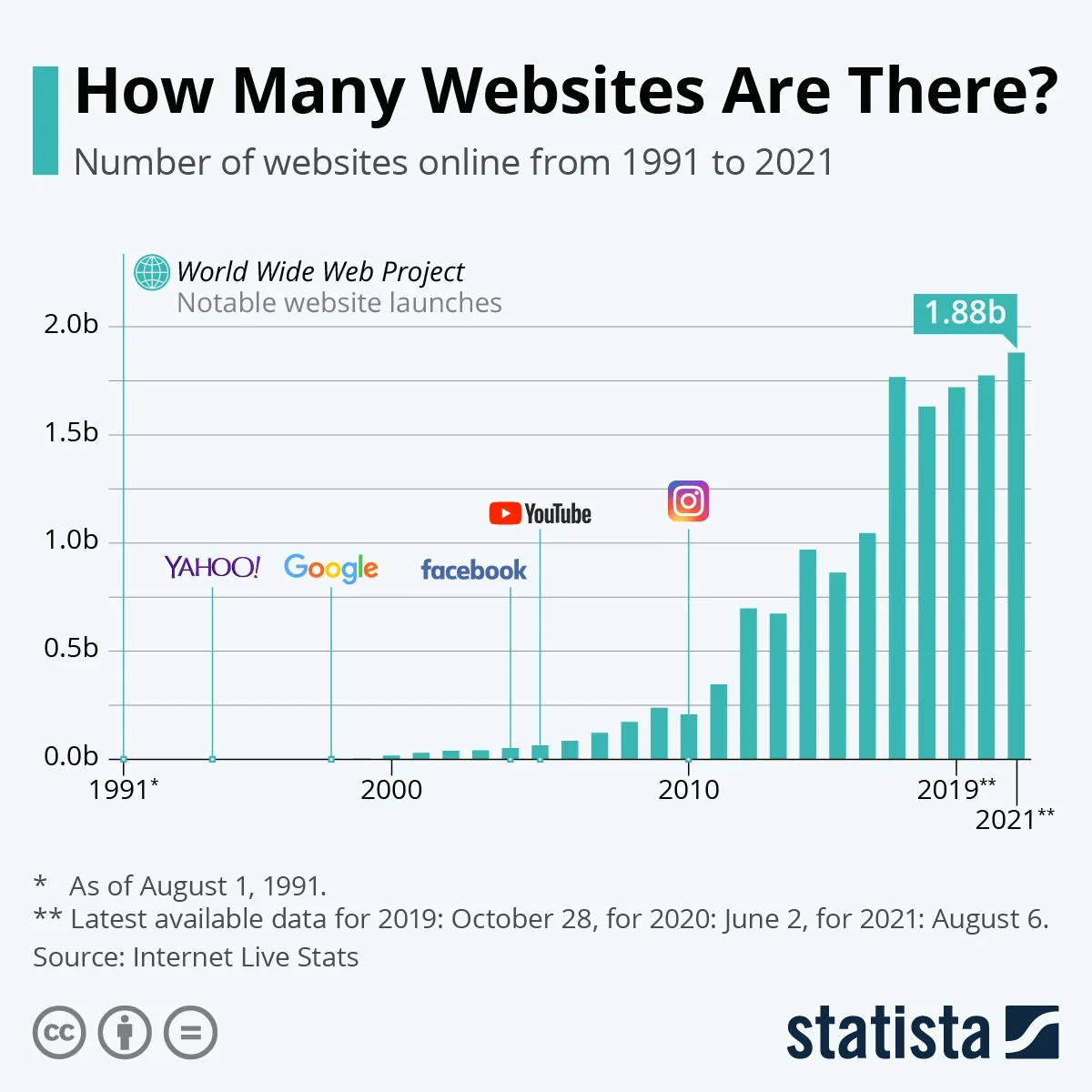
In 2021, there are about 1.88 billion active websites and over 5 million apps for Google Play and the App Store. With this overwhelming competition, your product has to be exceptional enough to stand out among the ocean of options.
Users expect a functional and easy-to-use product. If you fail to deliver, it’s easy for them to bounce off and consider alternatives. Nailing a great user experience for people means their immediate satisfaction and the sustainability of your product and business.
So today, we’re going to touch on the principles of a good user interface and what key elements will help you deliver them to users.
4 Key Elements of User Interface Design
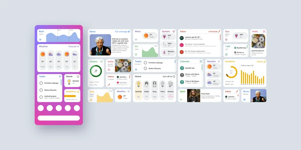
User interface elements are the touchpoints users utilize to interact with the product. There are a lot of elements you can use when designing a website or app. These are divided into four categories so it’s easier for you to know which one to use at any given task.
1. Input Controls
This group of elements allows users to input information into the product. For instance, in a registration process, input controls will allow you to add personal details like your name, address, contact information, and so forth. Anything that requires users to add in details to complete a task, input controls are what is used. Under this category are the following:
#1 - Checkboxes
This element is a small square that users can check or uncheck. This allows a person to easily and quickly choose one or more options from a set. In many cases, checkboxes are presented in a vertical list. But if there are too many options to include, a horizontal presentation is utilized.
Checkboxes have tons of uses. Travel booking apps can use it to let users choose their destination. Online health registration forms can use it to provide a selection of allergies a user potentially has. Rather than typing up a response to a query, using this is an easier way for users to get answers.
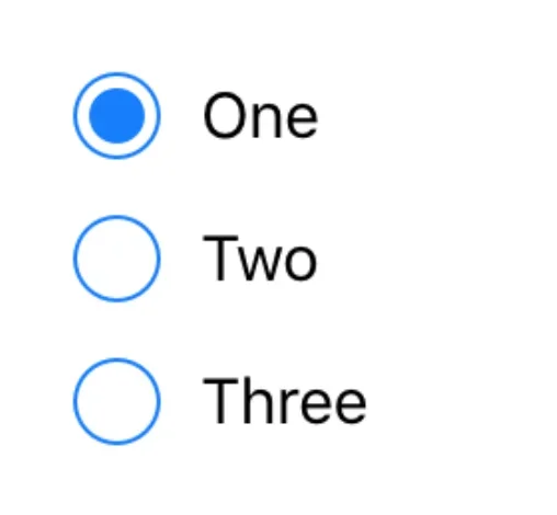
#2 - Radio Buttons
Radio buttons look a bit like checkboxes only that they are circular and are marked by a smaller circle rather than a check when ticked. They are also used in choosing a response from a selection. The difference it has with checkboxes is that radio buttons only allow users to choose one option while checkboxes allow for one or multiple choices.
#3 - Dropdown Lists
This element appears as a button but when clicked displays a list of options where a user can choose from. Dropdown lists are best used when you have limited real estate and have a lot of options to provide.
For example, if you’re trying to localize your app or website, a dropdown list can be used to provide a choice for the language a user prefers. You can also use dropdown lists to run down a list of functionalities like what productivity apps like Google Docs do.
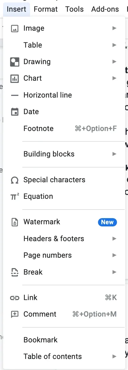
#4 - List Boxes
List boxes are a combination of dropdown lists and checkboxes. It lists down all the options available for a user but this time, they can choose multiple items from the selection.
#5 - Buttons
Buttons are used to tell users a particular action is made when they touch it. It’s usually displayed in a shape like a rectangle, square, or circle with a label of either an icon, text, or both.
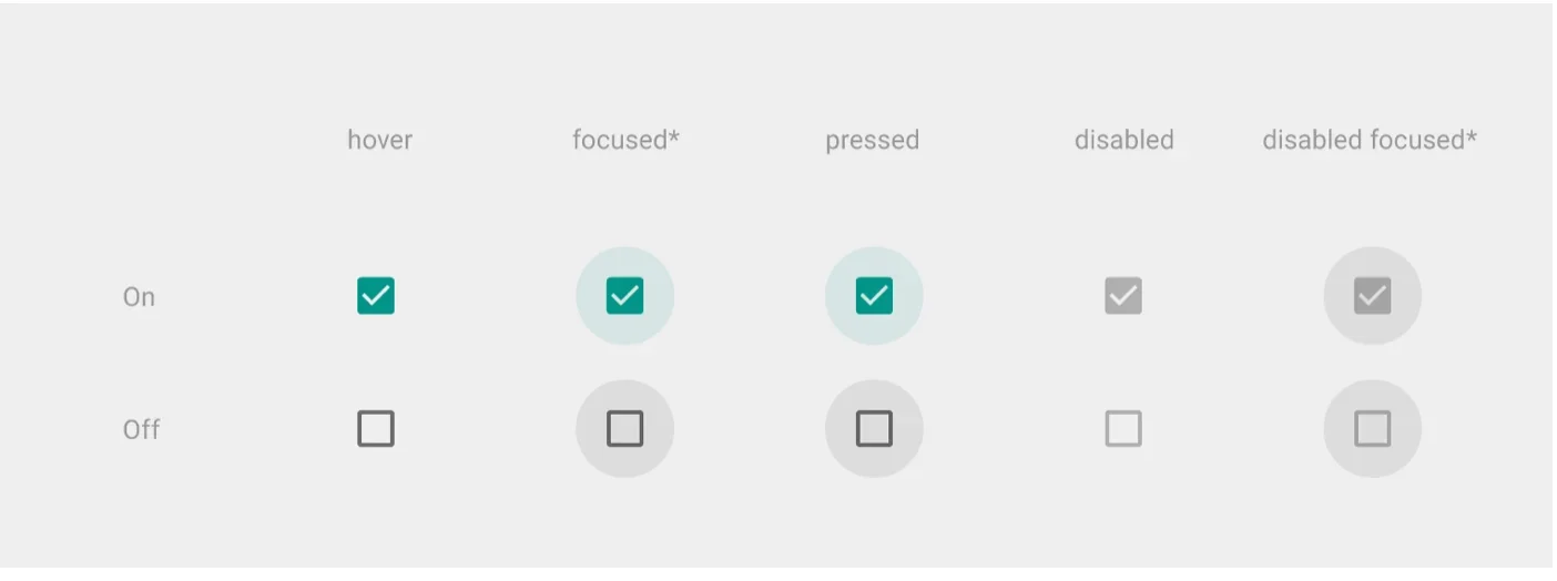
#6 - Toggles
This element is used to change a setting between two states, much like when turning on and off a switch.
#7 - Text Fields
Text fields are used to enter text information in either a single or multiple lines. Sometimes, a text field can be pre-filled with the text especially when the program has initial information about the user.
This element is mostly used in entering personal details like name, address, and contact information.
Apps can also use text fields to provide an avenue for users for a customized request much like when ordering food in a delivery app.

#8 - Date Field
A date field allows a user to pick a date or time. This can be used in scheduling an appointment, booking a hotel, or a flight. A calendar will be shown where you click on your preferred dates.
2. Navigation Components
As the name suggests, this group of elements is used in navigating a website or an app. It sets a user in motion to move around and accomplish tasks.
Here are seven elements you can use for navigation:
#1 - Breadcrumb
A physical breadcrumb leaves behind a trail you can follow back to where you’ve come from. A user interface breadcrumb works similarly. With it, you can leave trails of links to help users remember where they are at in the website or app.
This is often located on top of a page and is clickable so you can easily go back to preceding pages which makes navigating around easier.
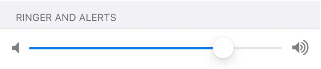
#2 - Slider
This element is also known as a track bar. It allows users to adjust certain values like volume or brightness to a preferred level.
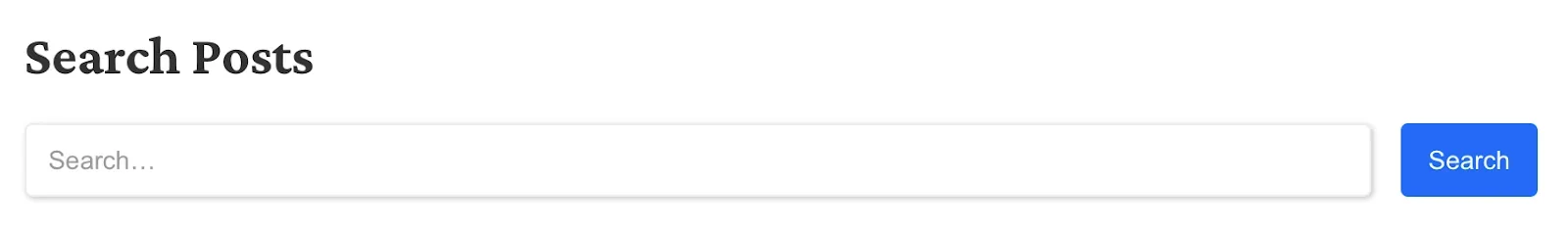
#3 - Search Field
This element is usually a single-line text box with a search button with text or a magnifying glass icon. When a user knows the particular item they are looking for, he or she can use the search box to get directly to the desired page. You can use advanced search tool to enhance your website's search capabilities.
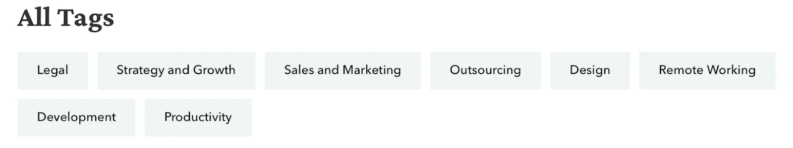
#4 - Tags
Tags are clickable labels. This interactive element is usually used to browse content or pages of the same category.
You’d mostly see this on the bottom of blog posts which also helps you easily determine which category the content belongs to.
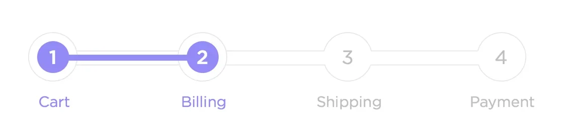
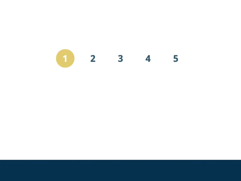
#5 - Pagination
This element is the clickable numbers indicating which page you are currently at. Usually found at the bottom of the page, you can also use this to skip between pages to find the content you need.
You’d see an element like this at the bottom of Google’s search engine result page as well as in the blog section of many websites.
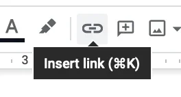
#6 - Icons
Icons are one of the most frequently used elements. It’s a hyperlinked button in the form of an image or symbol that helps users easily navigate within the system.
Having an icon with a universal image or symbol will make it easier for a user to determine what is it for and where they are heading within the app or website.
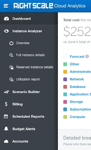
#7 - Navigation Menu
This is one of the core navigation elements. You’ll rarely find a website or an app that doesn’t have this. A navigation menu contains a list of labeled options that tells a user which part of the system they’ll go to once they click on it. This is usually found in either the header or the footer of a page.
In many instances, a hamburger icon or three stacked lines indicate a navigation menu. With a well-designed navigation menu, the system will be more usable and efficient to use.
3. Informational Components
Informational components inform users about what a certain button can do or provide insight on progress on a certain task. This also allows users to understand unfamiliar objects or introduce new features.
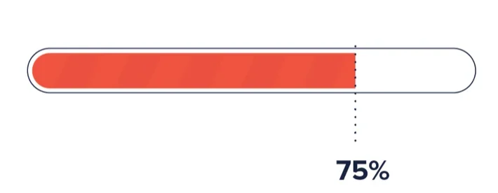
#1 - Progress Bar
This element indicates the stage a user is at in completing a series of steps or tasks in a process. With it, users can also determine how long it will take to finish everything.
This element is great for tasks that take a long time to carry out or for telling users how much longer they have to wait before a task gets accomplished. As an example, when downloading or uploading a file, a progress bar will show the development of the process and also ensure that an error didn’t occur.
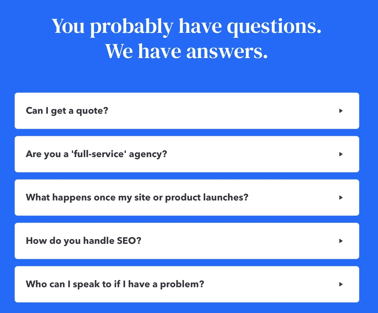
#2 - Tool Tips
This element is usually a small box that contains information about a certain feature within the system. It hints at the name or the use of that feature.
A tooltip usually appears when you hover over an item or a question mark icon beside it. It helps users understand how this part of the product will benefit them or what it contributes to in a process.
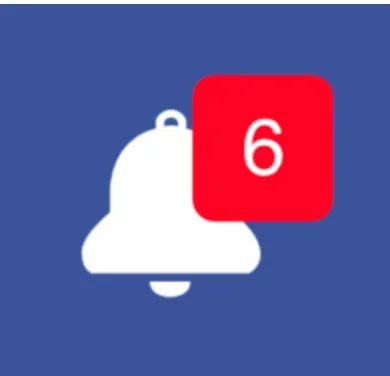
#3 - Notifications
A notification element is usually depicted by a red circle with an exclamation point in it. It is used to announce a message or an update a user needs to check out.
You’ll mostly see notifications on your phone on in your social media accounts when new activity occurs like when there’s a new comment on your post or when someone messages you.
Notifications can either be used for making new announcements, showing the success of a task, showing new messages, or errors that occurred.
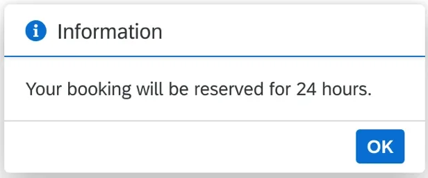
#4 - Message Boxes
This element is much like a tooltip. It’s in the form of a small window that gives useful information about a feature or an action to a user. It usually contains buttons, text, and symbols that provide instructions for the user.
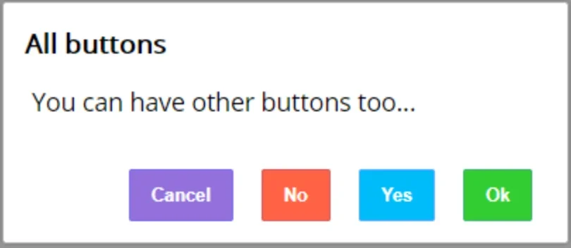
#5 - Modal Windows
Modal windows is an element that requires you to interact with it in some way like a click on a certain button before you can go back to the system. It’s a kind of element that won’t go away unless you make a certain action that it requires.
Sometimes this pops up when you are browsing a certain page and won’t go away unless you click from any of the options it provides. The main window will be partially visible but you won’t be able to control it unless you do something with the model window in front of it.
4. Containers
This group of elements is designed to contain certain features or related content. It’s usually in width or length smaller than the user’s screen size.
Here are three types of containers you can use for your product.
#1 - Widgets
This element either displays information or allows a user to interact with the product in a specific way. It’s like a small and simple software within an app or a website.
Web and phone widgets can either be a component in a dashboard, a chat window, or an embed for related services.
#2 - Accordion
An accordion is a vertically-stacked list of items that can either show or hide certain functionalities. This is great to use when there’s limited screen real estate but users need to navigate through the content quickly.
Instead of being superimposed on a page, this element can either expand or collapse. It’s usually used for secondary features or a large piece of content that users can either check out or not depending on their preference.
You’ll usually find these in online shopping sites containing specs or policies of the item sold.
#3 - Sidebar
This is a graphical control element that displays groups of components or sub-elements. Like an accordion, it can be switched between a visible and collapsed state. It’s typically located alongside the main display.
A sidebar is usually used in providing supplementary information or functionalities.
3 Tips in Creating the Best User Interface Design
As mentioned at the outset, a great user interface results in a smooth user experience. It’s more than just simply wanting to navigate and use the website easily, it’s about completing tasks without any friction.
Using the right user interface elements creates a visual language for a consistent and scalable experience. With that in mind here are four points to be considered in ensuring the best user experience using UI elements.
1. Consistency
A consistent user interface will allow users to utilize existing knowledge to new tasks and master features quickly. Additionally, it can prevent wasting time in understanding commands and controls, time that can better be used in completing tasks and solving problems.
With consistent use of user interface elements, the website or app is more recognizable and predictable.
2. Decrease Cognitive Load
This refers to how much mental processing is needed to use a product. With an overload of information by using redundant elements, users will get overwhelmed, miss important details, and jump off the website in search of something easier to use.
Reduce cognitive load by using familiar elements, applying content organization principles like an obvious call to action, and grouping related items. It’s also useful to avoid using meaningless text, old links, and irrelevant images or icons thinking somehow this will cause a new trend to help with brand recognition.
3. Users In Control
It’s already overwhelming to tread new waters or in this case, new websites and apps. It will be much worse when upon seeing the product, the elements are strange and unconventional. One key principle to remember is that users always want to be in control of their environment.
Using unfamiliar elements results in surprising outcomes or confusing pathways forcing people to feel out of their control and thus out of comfort. It makes them uneasy and scared about where a certain action may bring them.
When the elements are familiar, they’ll know what to expect at any turn thus be comfortable navigating around.
Bonus: Clarity
A clear and straightforward interface will make users confident about using the product. Confusion will be avoided and so they’ll be motivated to continue engaging with it.
Bad use of elements sticks out like a sore thumb, but if elements are used effectively users won't be distracted and can focus on accomplishing their goals.
Conclusion
To wrap everything up the elements you use should always go with what’s already familiar for the users and what provides the best functionality for them.
These elements aren’t just the building blocks for an interface, it adds the interactivity element that makes the product more usable and functional.
Providing the right touchpoints creates a seamless experience that helps them quickly achieve the goals and tasks they are using the product for.
Using the right mix of elements simplifies processes, ensures usability and long-term use for its target users. Build a wireframe and create a user story to ensure every element goes in line with the product goal.
Having a basic grasp of what each element can do will help you determine which ones will work effectively for the product you’re looking to build, a systematic approach that will draw in more users and retain the current ones.
Outsourcing Design?
If you're looking to outsource design work, it won't be enough to simply understand design elements. Outsourcing design can often be tougher than outsourcing development, since it'll require a lot more feedback and proper communication. For those looking to outsource design work, we highly recommend you check out our resources page, in particular our free e-books about scoping a project and how to structure a design project.
If you need help picking the right elements, organizing everything up, and designing the overall product you are looking to create, hit us up at resources@aloa.co and we’d be glad to provide you the help you need.