
Creating a friendly user interface can boost a website’s conversion rate by up to 200%. Without a doubt, investing time and effort in human-computer interaction will bridge the gap between your income goals and your actual bottom line.
Graphical user interfaces should just be more than a cluster of links and more than the 4 basic UI elements. It should be a platform for reflecting the goal of user interface for effective communication with your target audience. To help you achieve this goal, I’ve rounded up 15+ of the proven techniques for creating a friendly user interface.
By the end of this post, you’ll be packed with ideas, ready to implement for your website to get a bigger piece of the conversion pie.
Let’s get right to it.
How Does A Friendly User Interface Influence Your Product?
Communication satisfaction and product gratification are what all users subconsciously look for. Without it, visitors will be barging out of your website just a few seconds in.
A user-friendly interface should help with:
- Building brand loyalty
- Lowering development costs
- Improving customer retention
- Promoting customer confidence
- Increasing customer acquisition
- Increasing customer engagement
- Leaving a noteworthy website user experience
- Reducing/eliminating users' inconvenience
- Lowering bounce rates and improving SEO action
With these benefits in mind, let’s move over to the best practices to help jumpstart better turnarounds for your website.
16 Proven Techniques In Creating A Friendly User Interface
You can get too excited and would want to implement every practice from the get-go. However, I’d suggest you consider each one carefully and list down what’s easy to do and start from that. Once a technique is properly implemented, move over to the next one and see how it helps increase your bottom line.
1. Starts With Thorough Research About The Users
Know your users more than just what demographic data provide. Understand what they need, what they want to achieve, their pain points, the solutions they need, and observe their application behavior. This might require meeting with them face-to-face or watching them interact with a competitor's website. This way, you’ll understand what’s important to them and what others can’t provide. This will be what you’ll leverage to set an edge.
It doesn’t end there. Dig deeper and understand deep-seated and long-term desires especially when dealing with game interaction and end-user applications. While you can’t address them altogether, your software design can keep this in mind and find ways within the layout to incorporate solutions to those needs with minimal effort.
Insight helps make software development run faster. Allow no room for guesswork so there are fewer choke points when you reach the testing phase for the basic functionality of the project.
2. Talk Like The Users Do
Research about your users won’t only reveal their needs and pains. It’ll also reveal how they communicate. An academic tone will work for professionals. However, when used for sports enthusiasts, the engagement won’t be the same. You won’t get your message across as clearly as you would have if you talked the way they do.
When doing business, clarity plays a huge role so you need to communicate in the way your users do so your pitch resonates with them. The better it resonates, the better the conversions are.
3. Usable
A friendly user interface should always focus on the approach known to ease the use of any interface available to them. Understand the flow of functionality. There's nothing to wonder about if a user can’t understand the function of any webpage; they would prefer to leave immediately.
The usability of a user-friendly interface reflects:
- Easy comprehension
- Smooth display of applications
- Consistent and purpose-oriented layout
- Representative tasks to help succeed users in their business
Why does usability always link to a user's experience?
The perception and response to a website are determined by a user's experience of how the website turned out for him.
If, for instance, a web page is perfectly designed and matches all the qualities of a user-friendly design, users will, in turn, subconsciously keep a satisfying picture of the website and turn to it for any related need.
We at Aloa present a few usability characteristics that should always be practiced in creating a user-friendly design:
- For initial users: how easy is it to carry out their basic deals on the page?
- For the next assessment: how much time does it take to complete this task?
- How many errors are they making and are they able to recover from them?
- What impression comes to mind as they finish interacting with the website?
- In case of not using it for a certain period: how much of the visual design can they remember
4. Strikingly Pleasing For Crucial Deals
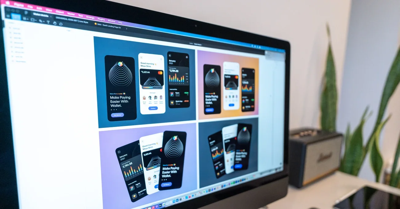
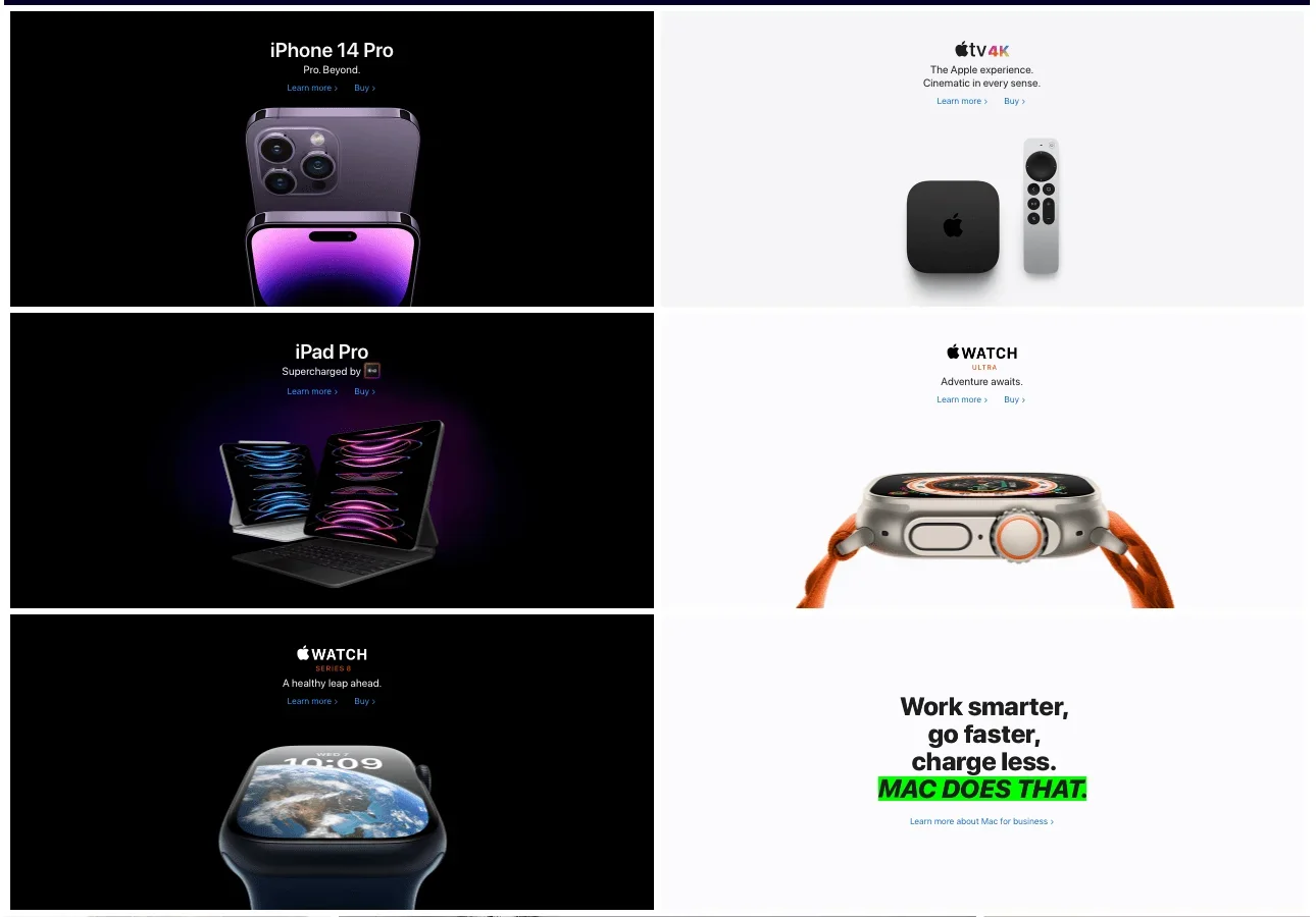
Visuals for any graphical user interface design are an important key point in capturing viewers' attention. The more attractive the user interface is, the more users will come your way. Take Apple’s homepage as an example: sleep, simple, but remarkable.
That's why Aloa collated strategies for a remarkable and traffic-generating interactive design. This includes:
4.1 Illustration
A functional layout configures all the common elements of the page in a way that is easily observable and follows a visual hierarchy leading the eye to the most crucial part of the page. It skillfully leverages 3D design spaces to draw the user to certain directions on the page.
4.2 Images
Adhere to the principle that images shouldn’t only be decorative, but also informative. You can strategically choose visual representations relevant and cohesive to the visual design. Your choice of images provides an easy explanation of complex concepts, giving a bird's eye view of the whole idea to the user.
4.3 Icons And Colors
These interface elements are added with the brand image in mind. We always make sure that our choice of icons and colors is consistent with the image your website is promoting. While we incorporate our take on the whole project, we also provide a few variations for you to choose from.
5. Comprehensible Typography
The font is a significant aspect of a friendly user interface. Not being readable doesn’t make it “friendly” at all. Hence, while this is an aspect where creativity can be largely fostered, always keep ease of readability in mind, applied to our website as well. Reading text anywhere on the website or a mobile device should be effortless.
There's a rule of thumb for the textual content of websites: 16 px font size for the text body.
6. Good Handling Of Errors
“To err is human, to forgive is divine”. While the term “user error” implies that it’s the user’s fault when something goes wrong, in a majority of cases, the fault rests with the designer creating a confusing interface.
There are two ways we help to lessen the impact of error:
6.1 Prevent mistakes before they happen
- Offer suggestions
- Make the action button clear
- Give real-time warnings
6.2 Provide ways to fix them after they happen:
- Support undo
- Provide error feedback
- Design practices to implement
Anticipating mistakes is often less frustrating than trying to fix them after. That’s why we create easily-learned graphic user interfaces to make the chances of making errors extremely low.
7. Loads Quickly
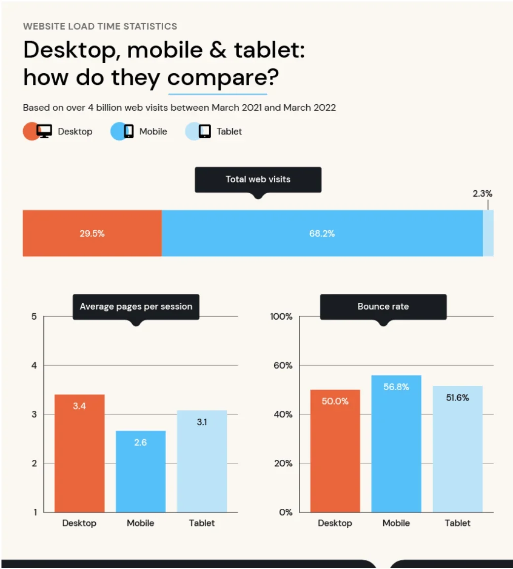
Slow-loading websites and apps cause a 9% bounce rate. When it comes to a handy interface, its speed matters a lot.
- Automate tedious and repetitive tasks.
- Make sure that the download and browsing speed is optimal and up to the mark for user comfort. While the average load time is 3.21 seconds, aim to bring the speed below 2 seconds.
- Make a way for users to not need to click 12 times to complete a routine task, set up a two-click process for that workflow
For all these checkpoints to work, make sure to optimize the pointer movements as well. It increases the speed and promotes a friendly user interface. It allows visitors to get where they want to be quickly and efficiently.
8. Give Enough Options
What works for one user might now work for another. However, if you give users too many options, they’ll end up not picking at all. So while it’s best to offer choices, limit it to at least 2 or 3.
If you have an eCommerce store, logically you’ll have a product catalog that lists all your offers. In cases like this, you can provide a recommendation section with 2-3 options to narrow down their choices.
9. Accountable
Ease of access and navigation make up the best experience and we made sure you enjoy a seamless experience. To ensure we are accountable to our clients and you to your website visitors and app users. We’ve rounded up this must-do list for our projects.
- Easy to find call-to-action
- Easy to operate progress bars
- Accessible language and tone for our audience
- Consistent and predictable formatting across pages
- Videos having subtitles or an accompanying transcript
- Use of high-contrast colors to show links and icons representing themes or topics
- Skip dense and technical language (unless crucial) in favor of easy-to-read text with descriptive headings
- Optimized number of CTAs to maintain the best potential conversion rates but not overwhelming for users
- An obvious way to submit the form, followed by a message notifying proper submission
- Our forms don’t ask for more information than needed
These accountability features will work to increase productivity with fewer frustrations and more satisfaction.
10. Keep Users In Control
A user-friendly interface has a design that gives you a sense of control or makes users feel empowered providing a flexible interaction between humans and computers. On the other hand, a UI design that leaves the user confused about how something works or where something can be found is a sure way to lose visitors and users.
So make sure to implement the following points:
- Be predictable, make navigation easy, and button captions clear
- Make the website adaptive and easy to learn and navigate for users
- Give users control by designing an interface that allows for looping animation or video auto-play
- Avoid overwhelming users by breaking blocks of text into readable sections with informative headings, aim for clean design
A friendly-user design is flexible and avoids clutter. This also allows for lowering the cost of misuse.
11. Tried And Tested
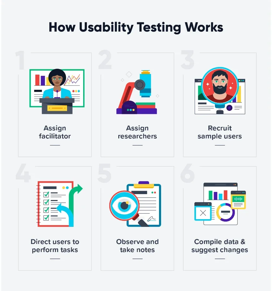
One of the most significant aspects of building a user-friendly website is usability testing. The best interface projects are tried and tested before they are launched. How do we assess before launching? Here are the key points we consider:
- Websites forms are made adaptive
- Usability principles and tests are strictly followed (this includes explorative, assessment, and comparative tests)
- A group of UX/UI designers observe and interact with the software project and give expert suggestions
- Representatives from the target audience interact, perform tasks, and browse the website while observed by experts then allowed to comment on their experience and suggest how to make the website or app better
12. Search Engine Facility
We know how important time is. The traditional search process can take ages. Hence, most of our projects search engines to make querying and finding specific parts of the website easy for users.
- For easy navigation and recognition, the search engine box is located at the upper right-hand corner of each page unless you, the client, have a preference
- The search engine is designed to recognize related terms in case you can’t remember the exact term of what you’re looking for
- The search engine is designed to display zero results if your searched term is not available
13. Operates Intuitively And Effortlessly
The user interface is connected to most, if not all, the users' touch points with your business in the digital space. Hence, it should be as clear as possible, or in other words, the layout has to be purposeful, and usable with minimum effort. If a user has to spend so much time recognizing what to do next when they land on the website, it’s a recipe for disaster. They’ll leave the site with no intention of coming back.
Because of this, here are Aloa, we ensure:
- All the components consider the principles of ease of use and elementary logic
- The buttons are labeled clearly and navigation is easily understood
- There are immediate help channels for confused users
To make sure clutter is avoided, we have strategically arranged all the icons according to the principles and experience checklist we have compiled from years of working on these projects. Also, white space sections are strategically incorporated to allow the page design elements to “breathe”.
14. Feedback Section
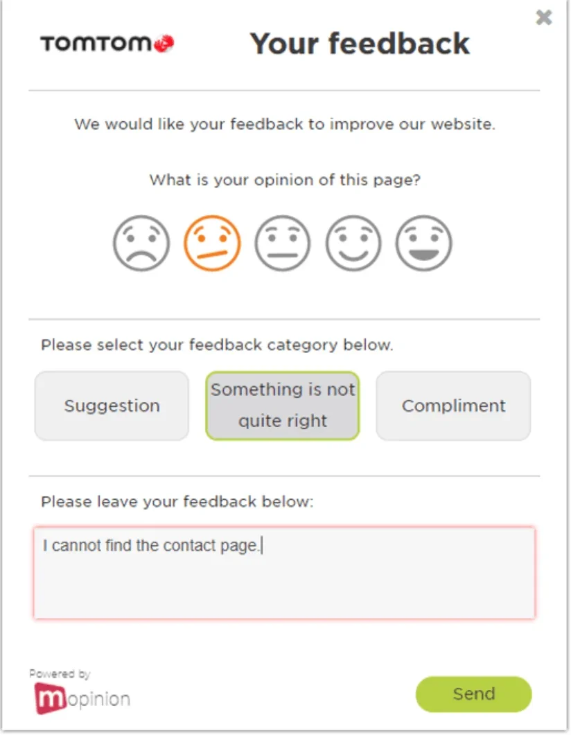
While we’ve covered and fixed most usability issues during usability testing, we recognize the slim chance that some users still have other concerns we need to address. As said, “there is always room for improvement”.
Hence, our interface projects are designed in a way where users can add their comments, reviews, or feedback if the client allows for it. The feedback section is highly important for us so we can serve you better each day.
15. Comprehensive Support System
We do what we can to make users empowered when using the website or app. Whether it’s a common software design or an exclusive high-end program, it should come with an informative support system design for all operating systems.
We have short-listed some salient features we can arrange for your software project to give users the best support they can when using your software:
- FAQ page
- Interactive chatbots
- Issue submission form page
- Comprehensive knowledge base
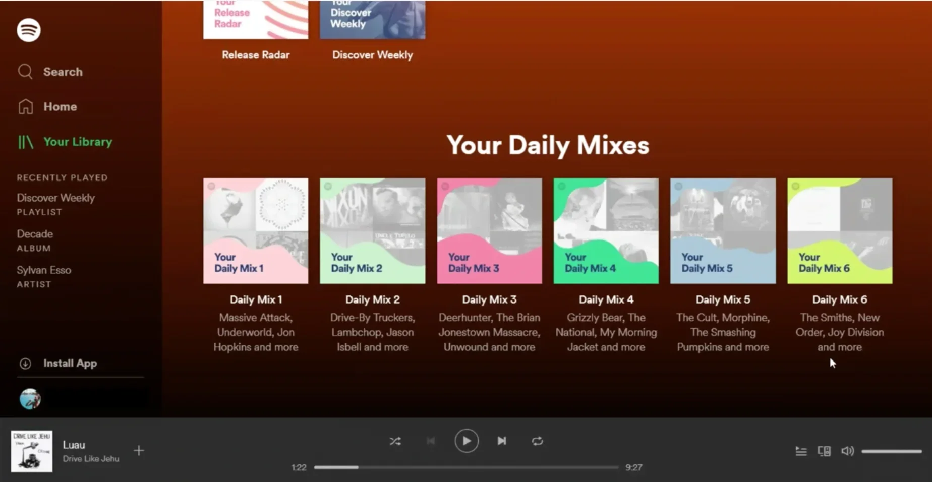
16. Consider Personalization
Personalization builds repeat engagements and brand loyalty, 2 things every business will want to accomplish. With personalization, your users become well aware of your concern and interest in them. This will be reflected in the products you recommend for them (Spotify example below), the availability of themes for them to choose from, and the power to disable features unnecessary to them.
However, personalization should be done in moderation. Go overboard and your users will feel like they are stalked. Strike the balance.
Additionally, while you can allow them freedom of choice with digital control panels, some users can end up disabling important features without realizing how crucial they are. When this happens, check out how competitors solve this kind of problem so you’ll get an idea of how to move forward with it.
A better option though is to consult experts with years of experience in this field. We at Aloa can provide you with senior user interface designers to assess the situation and provide tested opinions on what to do next or options for you to consider.
Conclusion
Investing in creating a user-friendly interface brings countless benefits, for one, there’s the potential for the 200% boost in conversion rate mentioned at the outset. While all these best practices are important, starting with research on your users is the best course to take.
In-depth user research will direct the next choices you will make for usability, engaging layout, error handling, intuitive operations, and personalization. Additionally, it’ll lessen the chance of negative feedback and hopefully eliminate the need for major reworks.
If you want to make this entire process a whole lot easier for you, we can provide you with the help you need here at Aloa. With our vetted user interface experts, you can rest assured all the best practices are applied, research and testing are thoroughly done, and the finished product gets completed bearing the advantages a friendly user interface can bring.
Let’s start with a consultation. Email us at resources@aloa.co and we’ll see how we can accelerate your software project with our design service.