

When I first set out to build a tool that would automate newsletter formatting, I genuinely thought it was going to be a simple two-day project.
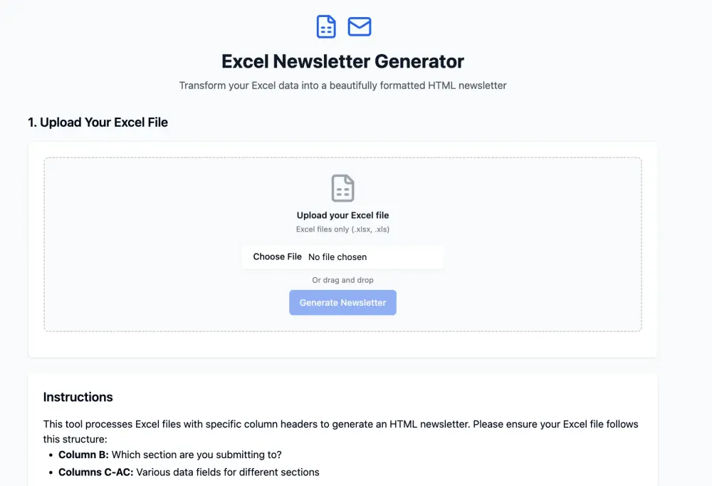
The mission was clear: take structured information from a spreadsheet — specifically submissions collected through Birthright Excel’s Monday.com forms — and automatically generate a clean, styled HTML newsletter.
(This data is sensitive, so we used dummy data to mimic the flow.)
No heavy lifting. No drama. Just clean automation.
What unfolded was anything but simple. It was a marathon of frustration, dead-ends, mid-build pivots, stubborn iteration, and ultimately — growth. This is the full story of how a “small” no-code project turned into one of the most satisfying and educational technical builds I’ve done.
The Vision: Why Automate?
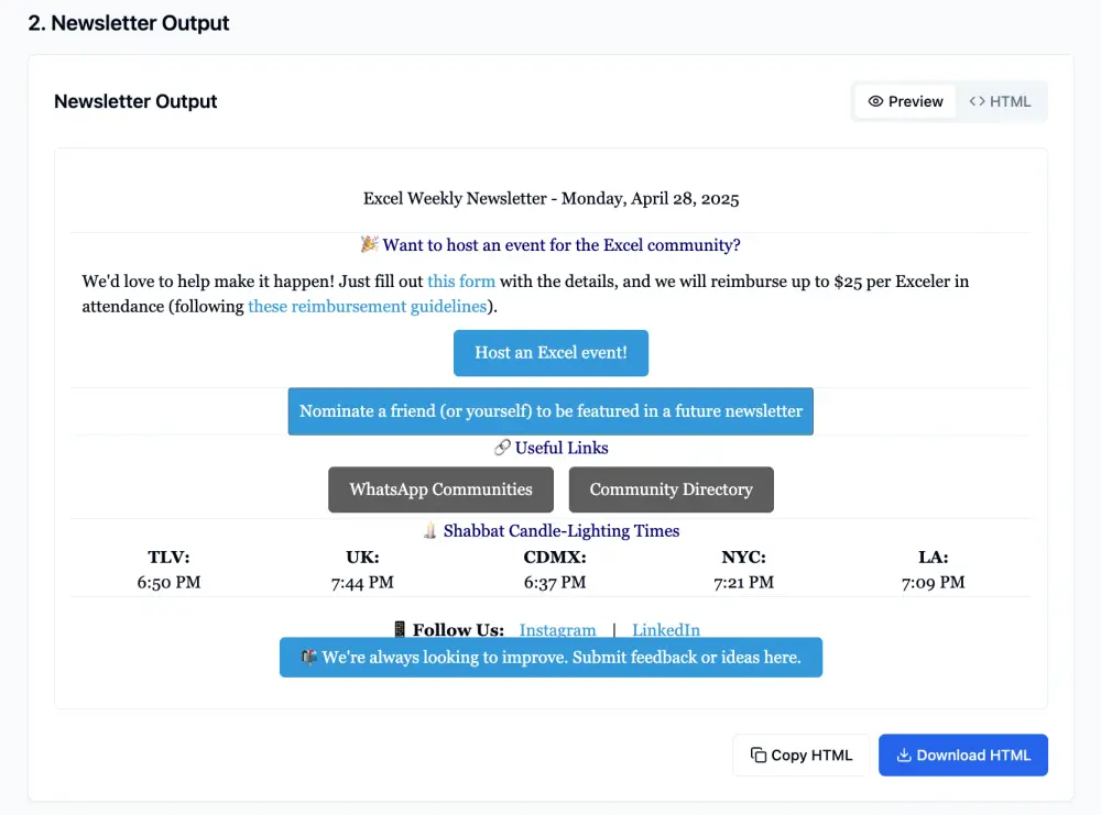
Birthright Excel sends out a weekly newsletter. Same structure every week: event updates, job opportunities, readings, shoutouts — always formatted in a consistent, branded style.
Currently, someone manually compiles all the information, formats it in HTML, styles it to match branding, and then sends it out. Every week. From scratch.
The dream was to kill that manual process. Let people submit their content via a form. Auto-generate a clean spreadsheet. Upload that spreadsheet. Click a button. Out comes a polished, fully ready HTML email.
Automate the boring parts. Save hours of time. Eliminate human error.
Simple idea. Not-so-simple execution.
Step 1: Extreme Overconfidence
When you first start using no-code tools, it’s dangerously easy to believe that anything can be done quickly. Drag and drop. Smart prompting. AI filling in the blanks.
I thought the workflow would be:
- Form → Excel → Web App → HTML Output
Straightforward.
I didn’t account for how brittle no-code tools can be when it comes to structured data interpretation, variable mapping, and format-specific HTML rendering.
But hey, ignorance is a necessary part of starting.
Platform Hopping: Lovable, Chef, and V0
Attempt #1: Lovable
I started by testing Lovable — a no-code platform that looked easy to use and promised simple file-to-output automation.
I uploaded an Excel file. Uploaded last week's newsletter template. Gave basic prompting instructions:
"Use the Excel for data. Use the template for structure and style."
Instead of merging the two, Lovable just... ignored the spreadsheet entirely. It used the static newsletter template for all data — filling in the same dummy information every time.
I clarified the prompt. Again. Again. And again.
Each time it got worse: formatting broke, sections misplaced data, infinite loops of the same template content, newsletter outputs getting cut off halfway.
Eventually, after a day of wrestling, I abandoned Lovable.
Attempt #2: V0 (First Try)
Next stop: V0 — a more sophisticated platform designed for no-code app building with deeper developer flexibility.
Feeling optimistic, I decided to start small. Instead of formatting, I asked V0 just to read and summarize the spreadsheet.
Even that went sideways.
It grouped wrong sections. It created empty bullets. It couldn’t parse examples correctly without mistaking them for absolute instructions.
I slowed everything down. Hyper-literal prompts. Mapping each column manually. Listing out how to treat every row and field. Teaching it the entire structure explicitly.
Eventually, it could read and organize the spreadsheet — but formatting was a disaster. Plus, V0 didn’t support native Excel uploads properly at the time.
Another dead-end.
Attempt #3: Chef
Third platform: Chef.
Gorgeous UX. Great first impression. Huge problem: no file upload ability.
Two minutes in, I knew Chef wasn’t viable.
Goodbye, Chef.
Return to v0: Vibe Coding With A Vengeance
At this point, I had a realization: tools like Lovable and Chef were too "shallow" for the complexity I needed.
If I wanted precision — real mapping, clean formatting, solid handling of variable data — v0 was the only real option.
I came back to it with a vengeance.
I rewrote the entire prompting logic:
- Uploaded the raw HTML template of a previous newsletter.
- Inserted dynamic placeholders like {{event_title}}, {{job_description}}, {{reading_summary}}, etc.
- Gave explicit HTML structure and styling instructions: Georgia font, centered headers, blue links, <hr> dividers.
- Mapped each spreadsheet field to its output block.
- Outlined fallback rules: "Skip empty fields, group by section, generate repeatable structures."
The prompt was 10x longer, 10x clearer — and 10x more bulletproof.
When I ran it with dummy data, it worked. The HTML output was beautiful. Structured correctly. Styled properly.
This felt like a win.
And Then: Spreadsheet Reality Check
Feeling confident, I uploaded a real spreadsheet to test.
It fell apart instantly.
Real-world data always has more edge cases, more inconsistencies, more quirks than dummy data.
Rows didn’t map properly. Blank fields weren’t skipped cleanly. Sections jumbled.
Dummy success meant nothing if live data broke it.
Time to go deeper.
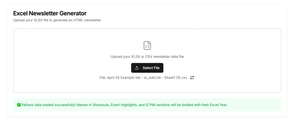
Major Breakthrough: Clean Your Inputs
I realized the core issue wasn't the prompt.
It was the data itself.
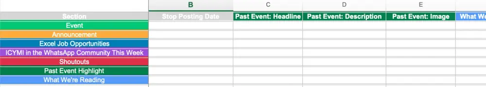
The Excel export from Monday.com had junk rows (branded content), junk columns (tracking metadata), messy headers (long question phrasing), and inconsistency in data types.
So I cleaned everything up:
- Deleted the first two junk rows and columns.
- Renamed all headers to be short, structured, and section-linked (e.g., "Announcement: Description" instead of "What is the announcement text?").
- Ensured Column A was the Section field and Row 1 was the true header row.
Suddenly, the data looked clean. Robot-readable. Predictable.
When I re-ran it through V0?
It worked.
Perfect sectioning. Correct bullet formats. Titles bolded. RSVP links hyperlinked. Contact names cleanly linked.
95% of the heavy lifting done automatically.
Taking It Further: Inline Responsive Editing
Once the foundation was stable, I decided to make the tool even better.
I added a rich inline editor on the HTML preview.
Now users can:
- Edit text, colors, fonts, and links inside the preview
- Fix typos, update event info, or tweak styles live
- Save or copy the final HTML without ever touching raw code
This made the tool dramatically more flexible.
If automation handled 95% of the load, the inline editor handled the last 5% — quickly, cleanly, intuitively.
New Challenge: Dynamic Summarization
Because I apparently hate myself, I tried to push the automation even further.
I wanted the tool to auto-summarize linked articles (for sections like "What We're Reading") by:
- Reading the link from the spreadsheet
- Fetching the page
- Summarizing the article
- Inserting a cleaned-up blurb into the newsletter
I tried:
- GPT API integration
- Perplexity API integration
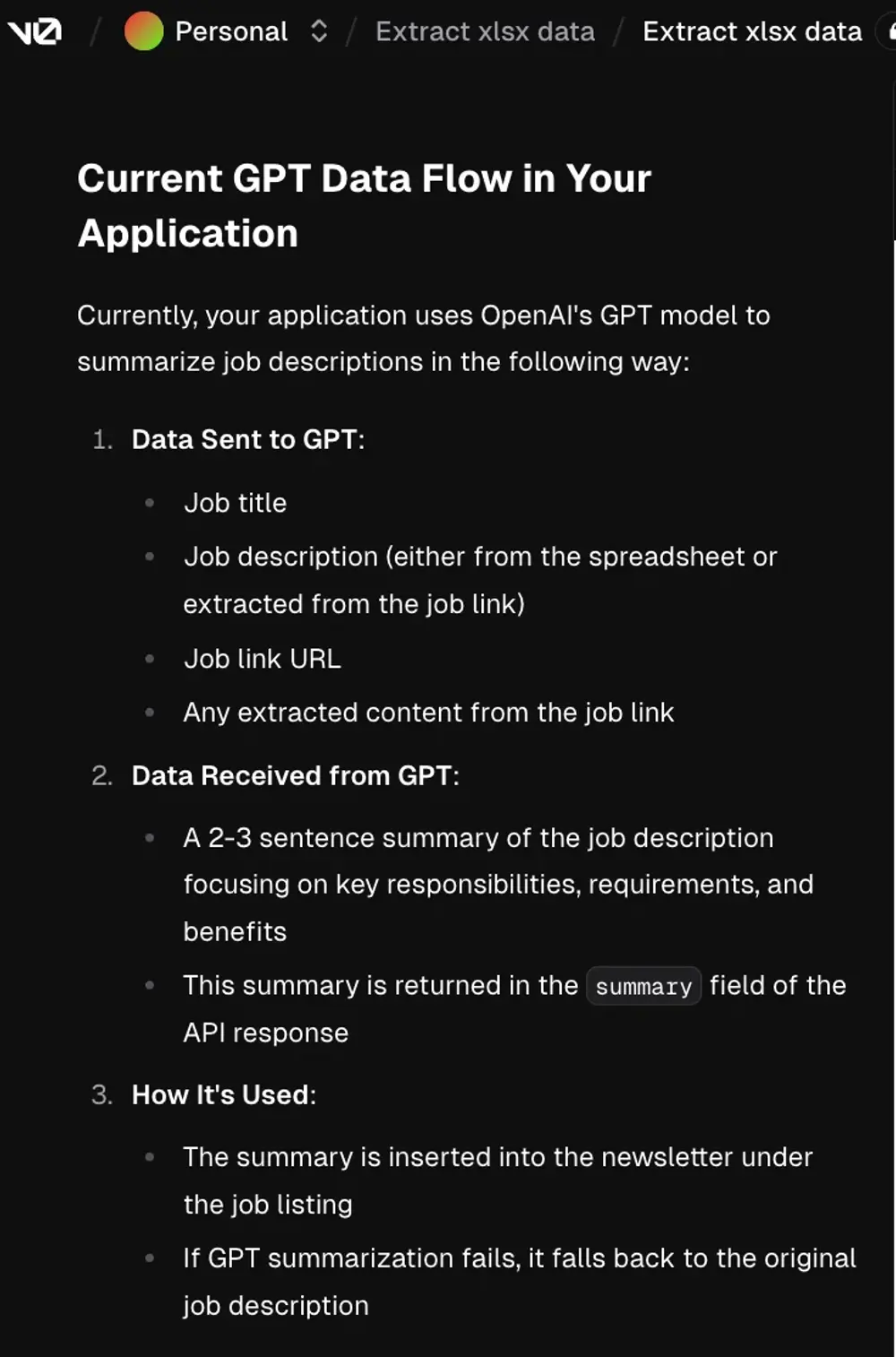
Both struggled badly.
- GPT was unreliable at fetching live web pages.
- Perplexity couldn't consistently summarize or format outputs cleanly.
- URLs weren't parsed properly.
- Summaries were inconsistent or failed entirely.
Workaround: Edit As Needed
Since dynamic summarization was unreliable, I landed on a new system:
- Generate the full newsletter
- Use the rich text editor to quickly fill in or polish any missing summaries
- Save/download final HTML manually
It’s not full end-to-end automation yet — but it’s extremely usable, especially compared to where I started.
And it’s light-years better than manually building HTML every single week.
What I Learned (And Keep Learning)
- No-code ≠ no logic. If anything, it demands more system design thinking.
- Structure your inputs first. Clean data = better outputs.
- Prompt like a lawyer. Assume nothing. Define everything.
- Automation is about trade-offs. Perfect systems rarely exist; flexible, human-editable ones win.
- Every failure teaches precision.
Every bug. Every broken attempt. Every ugly output forced me to tighten my thinking.
TL;DR
Set out to automate a weekly newsletter from an Excel sheet.
Ran into wall after wall with Lovable, Chef, and even V0.
Smashed through by cleaning the input data, tightening the prompts, and building fallback editing tools.
Dynamic summarization still needs work, but everything else runs smoothly now.
Learned a massive amount about no-code development, prompting, data architecture, and system flexibility.
And honestly?
I’m having more fun now than ever.
Final Reflection
This started out feeling like a minor project. It became a serious skill-up experience.
Not just about "building a newsletter tool" — about:
- Learning how to design around real-world data flaws.
- Learning how to think structurally when prompting and feeding AI.
- Learning how to layer human flexibility into automation instead of chasing "perfect" end-to-end workflows.
If you’re building anything automated — especially anything with user-generated content — I can’t stress this enough:
Plan for imperfection. Build for editing. Iterate endlessly.
The reward is not just the tool itself.
It’s becoming the kind of builder who can survive the chaos — and still ship great work.